PRODUCT DESIGN. UX/UI DESIGN. CREATIVE DIRECTION
–
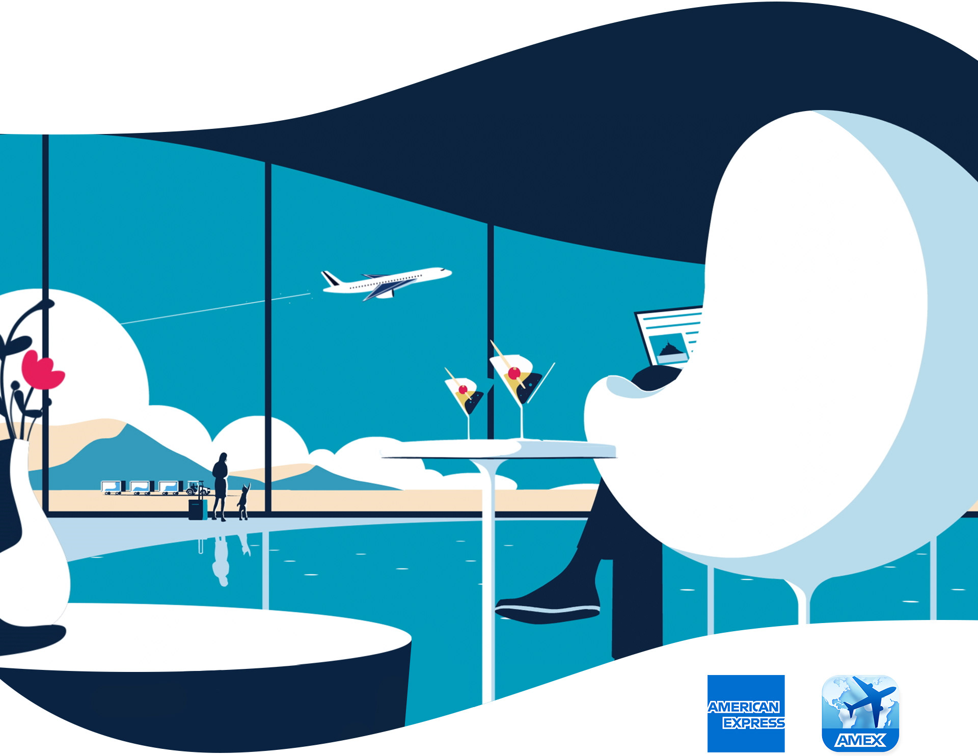
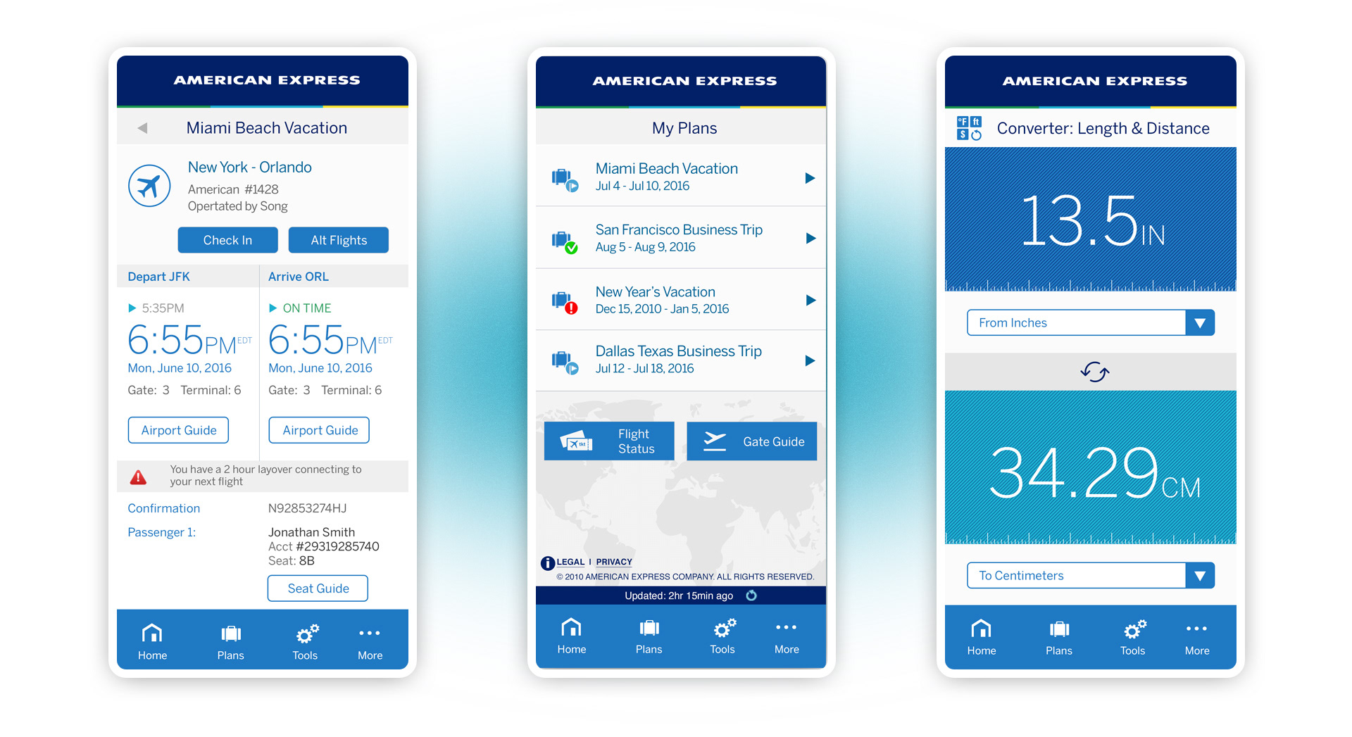
American Express, one of the world's most recognizable brands, needed to communicate its brand and demonstrate best in class user experience through its service-oriented Travel Application across multiple mobile platforms. The application experience was designed to be a personalized travel concierge, delivering time-sensitive alerts as well as showing activities and entertainment in or in proximity to various local points on one's itinerary, including but not limited to airports and hotels. Each card (Green, Platinum, or Centurion) unlocked different levels of service, with Centurion offering the most personalized opportunities
Leadership Role
• Directly managed the product team consisting
of UX/UI and creative
• Hands-on development of UX/UI
• Creative and design direction
• Directed front-end development
• Directly managed the product team consisting
of UX/UI and creative
• Hands-on development of UX/UI
• Creative and design direction
• Directed front-end development

The Challenge
Our core challenge to go above and beyond all other travel applications, with the white glove service American Express customers expect.
Goals
Define our travel audience through In-depth user research
Evaluate best-in-class mobile user experience practices both in and out of the category
Design an intuitive user-centric experience that delivers time-sensitive travel data with speed and ease of use
Develop an intuitive user interface that provides a feature-rich experience in a simple, stylish, American Express brand focused manner
Offer diverse sets of tools based on card status
Give American Express customers the travel edge, getting them to their destinations quickly and effortlessly


The creative concept
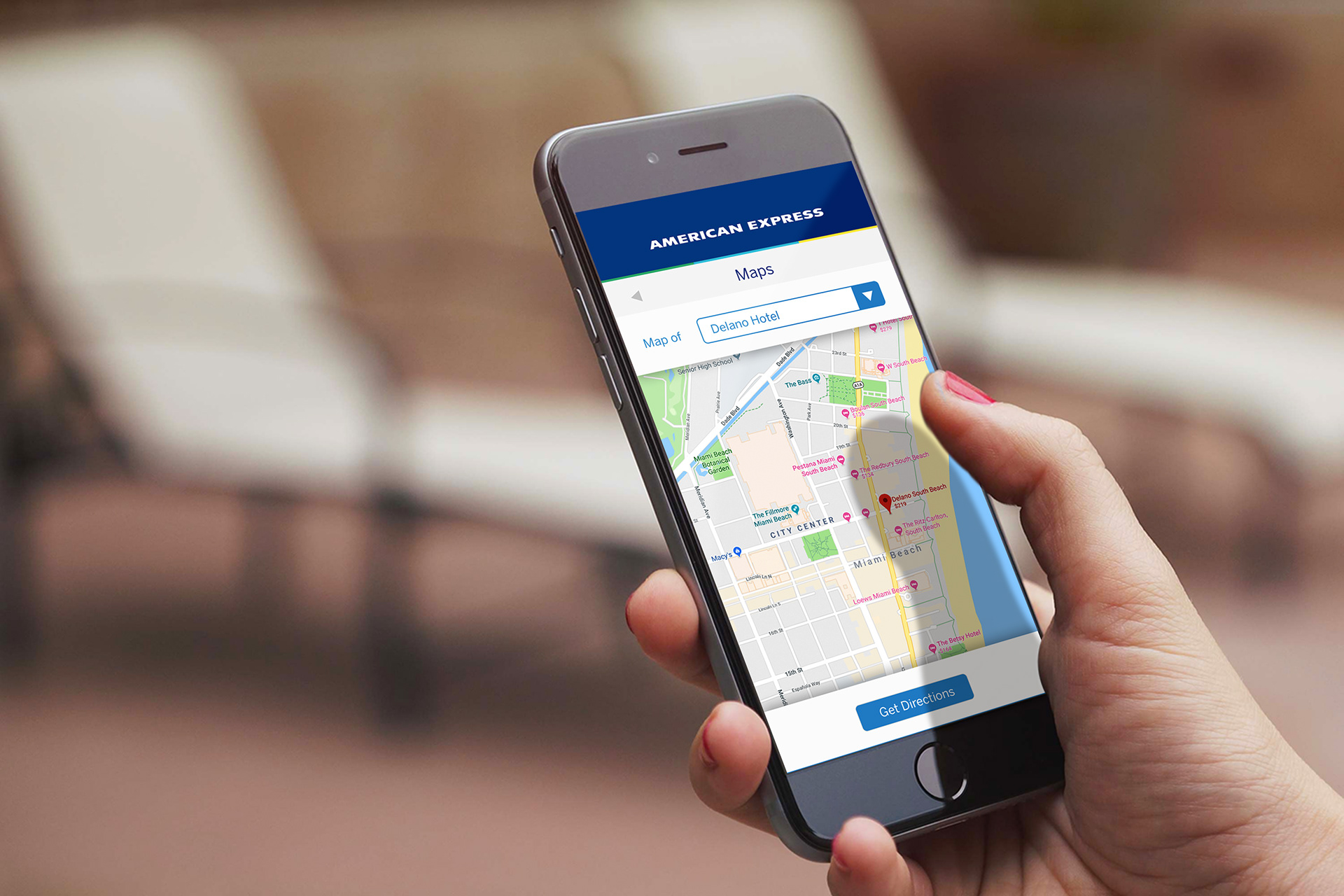
A brand deeply dedicated to customer service, American Express is committed to using its capabilities and resources to help people have extraordinary travel experiences. The Travel App was created to foster a deeper emotional connection with both customers on-the-go and business partners.
We created a strategy and story around the “Always On Concierge,” a travel companion that is always with you, helping with everything from finding your gate, locating restaurants in and out of the airport, or helping you book a car through one of their trusted partners. Based on what card a customer holds, (Green, Platinum, or Centurion), members receive benefits and services that are leveled up to membership type. Ultimately, the Travel App would allow you to do more and limit the stresses of travel.
What we did
• Digital strategy
• Creative and design briefs
• Sketches and mood boards
• Hi-level journey maps
• Creative and design briefs
• Sketches and mood boards
• Hi-level journey maps

UX Design
With our user research and strategy findings complete, we now had a deeper understanding of whom we were designing for and what they wanted. Next it was time to define the optimal experience.
What we did
Initial analog sketches were created to quickly get some big ideas on the table and pressure test them
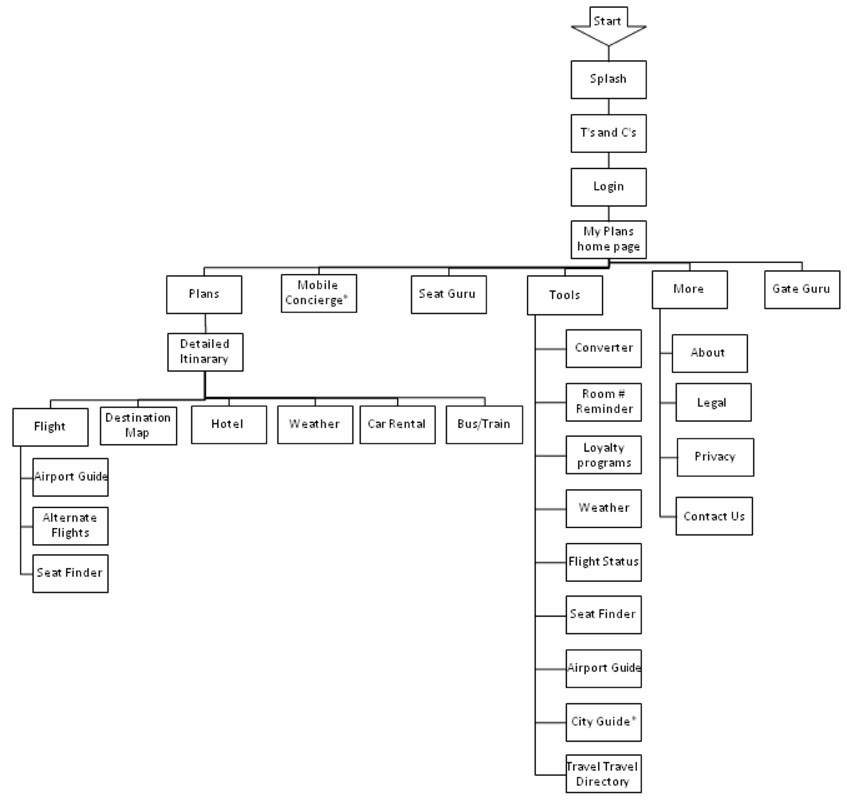
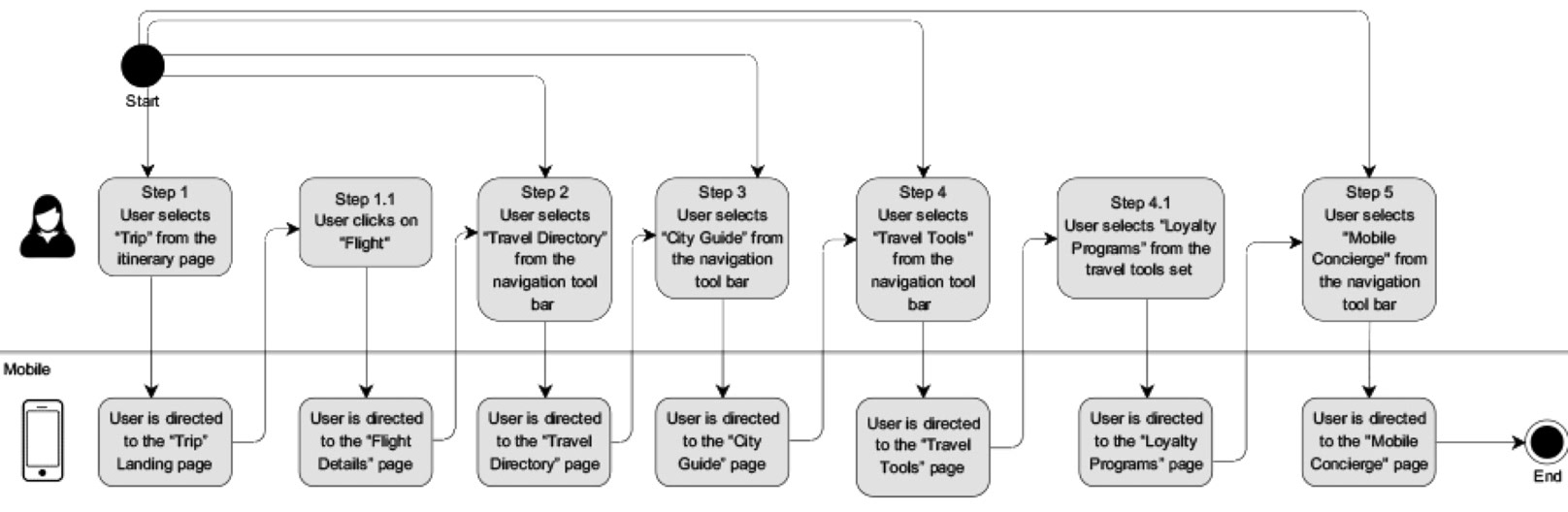
User flows were generated to better define key interactions and to help envision an overall “design system” that would be refined
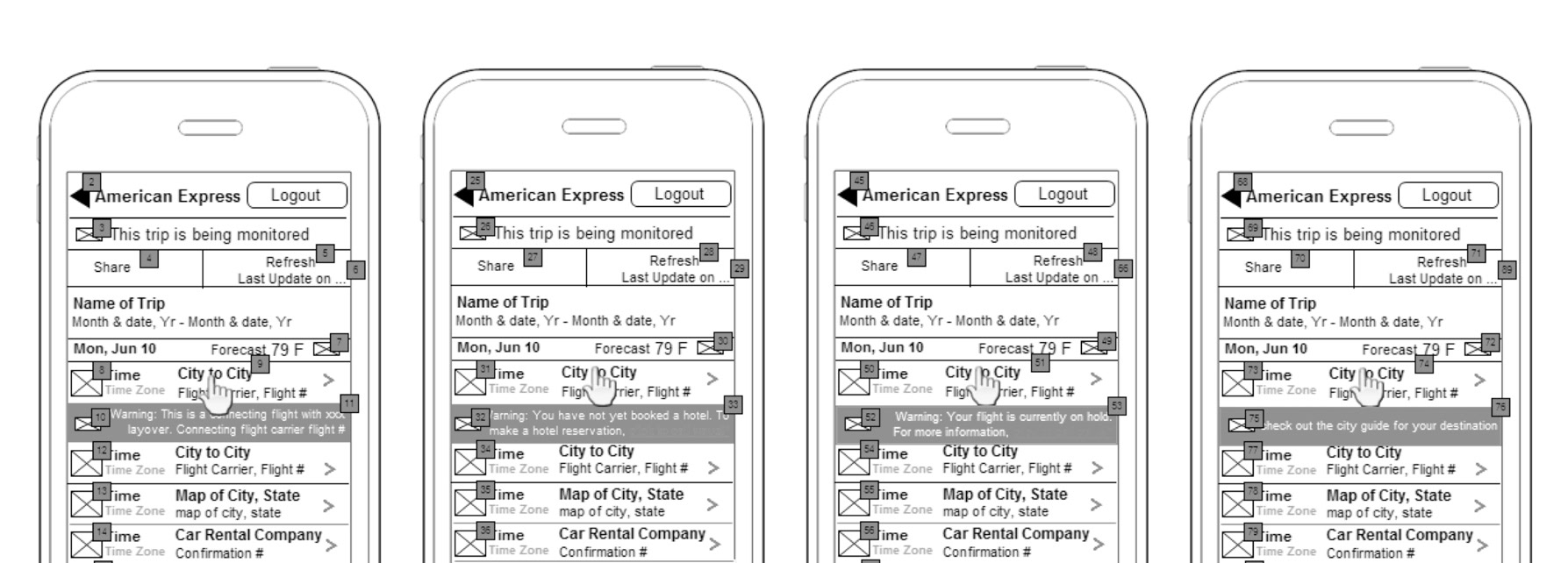
A detailed set of core template wireframes were created for all platforms, and modified throughout the UX/UI, prototyping and testing phases
Created prototype for testing during the UX/UI phases
Detailed specifications documentation

Prototyping
Low and high fidelity prototypes were created and tested at various stages of the project. We used low-fi prototypes in-house to test more specific navigational elements, especially on mobile, and higher fidelity prototypes to test with user audiences.
What we learned
• Line listed items needed to be more pronounced for better on-the-go scanning, i.e., trip data
• Alerts for travel delays and updates needed to be more pronounced, i.e., alter icon and messaging sizes
• Users wanted one tap to view all plans; the My Plans feature was made consistent in the main navigation
• User enjoyed auto-fill functionality for any content that needed repeating
• Personalization tools were appreciated but too small for most mobile devices
User Testing
Once the team had a prototype ready for use, we were prepared to put the app into the hands of our users. At this point, we were able to validate ideas and concerns about the designs. While in beta, we conducted focused audience, in-house, and guerrilla user testing, which highlighted the top risks in the product to be:
• Toggling between accounts
• Adjusting font sizes for optimal on-the-go scanning
• Mobile navigation system (bottom anchored main nav)
• Adjusting font sizes for optimal on-the-go scanning
• Mobile navigation system (bottom anchored main nav)
In addition to testing UX/UI, we also tested the following branded elements.
• Focus group testing for branding across the three card types (Green, Platinum, and Centurion)
• Branded iconography testing
• Branded imagery testing
• Branded iconography testing
• Branded imagery testing
How we tested
• Live focus groups
• Group video conferencing - UX/UI
• A/B testing for branded elements (in prototype and live beta)
• Online surveys with target user groups
• Group video conferencing - UX/UI
• A/B testing for branded elements (in prototype and live beta)
• Online surveys with target user groups

UI Design
After testing the UX designs via mockups and prototypes, we moved into designing the visual interface and all associated design elements.
What we did
Working from user flow diagrams, we developed a series of preliminary sketches with which to start.
We created several design iterations that leveraged the Amex brand system and quickly tested with team leads for validation
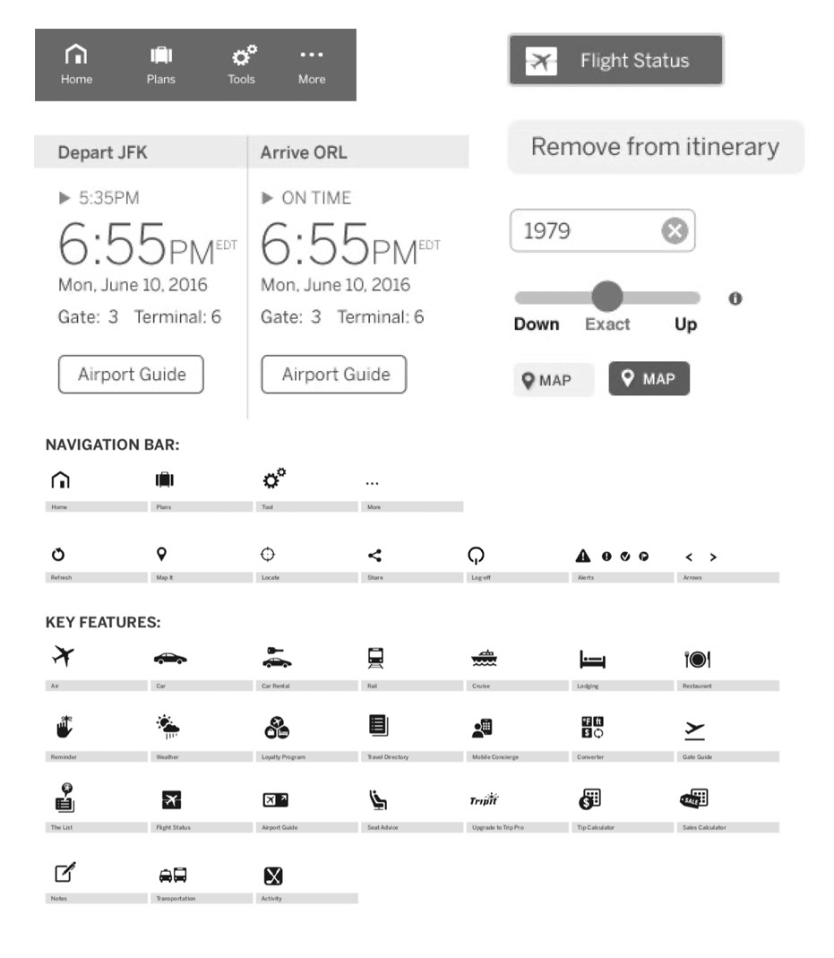
Designed and produced SVG icon sets
Designed and built pattern systems
Testing/validation, user feedback, and reporting
Detailed interface design specifications focusing on colors, image use, themes, styles, patterns, and iconography were created and shared with the front-end development teams

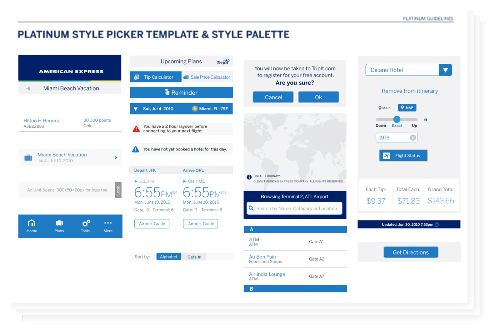
Style Guides
Comprehensive guidelines and specifications where created to be shared with the development team.
Guidelines/Specifications Content
Base guidelines
Navigation and button states
Sample screens
Iconography
Typography
Color
Graphic images
Detailed specifications and annotations